NO COLLECTION
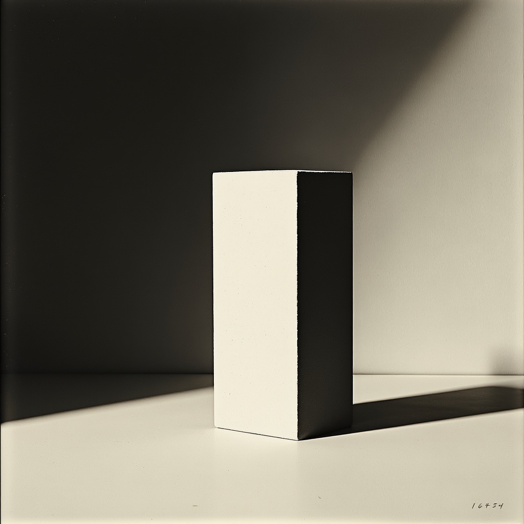
Architecture of Reduction.
Architecture of Reduction.
Addition is easy. Every brand does it. NO Collection removes — color, ornament, the decorative impulse, the fear of emptiness. What remains is not absence. It is the highest form of discipline. The person who chooses NO Collection has already decided what they want. They are not here to discover. They are here to confirm.
Primary = Charcoal + Warm Ivory ONLY.
Forbidden: NO botanical greens. NO muted brass. NO pattern. NO warm gradients.
Every color decision on this page must pass this filter. If it is not charcoal or ivory, it does not exist here.
Motion = Stillness as primary state.
Negative space is a design element — not an absence, but a presence.
Geometry = Precise, hard edges. Nothing soft or organic on this page.
Space speaks. Silence speaks. Restraint is the loudest signal.
Reformation-aligned — progress through removal, not accumulation.
Every element present because it must be. Not because it could be.
If the question is "could this be removed?" — the answer is always yes.
The question is: does it remain anyway? And if not: out.
All products on this page use UNIT naming.
Access Unit. Chassis Unit. Head Covering Authorization. Analog Memory Cube.
Never "hoodie." Never "tee." Never casual retail language.
The name is the product. It communicates function, collection, and position in one phrase.
NO Collection is the "reset" district of the universe.
Where citizens come when they've stripped away everything inessential.
Not minimalism as trend. Minimalism as final form.
This collection is what remains when everything else is gone.